UX in ATX WEBSITE ILLUSTRATIONS
In August of 2020 I was approached to do a set of 3 custom illustrations for the website of a local UX networking group based out of Austin. The design team needed 3 illustrations for the main call to action buttons on their site; Find Events, Join Us, and Get Involved. They requested in their brief that the designs be easily understandable, unique, and have a distinct Austin ‘feel’ to them. They gave me a set color palette and permission to stray outside of it if I had an idea. And stray I did.
So I came up with a symbol, something that was a universal experience in Austin and Central Texas, identifiable and relatable, while still being inclusive of people from other places outside the Austin area. I chose the grackle. Why? Because why not. They’re everywhere, they’re omnipresent and iconic in Austin, and I thought it would be absolutely hilarious. It was, and the stakeholders and design team loved it.
So without further ado, I introduce The Grackles.
Delivery went smoothly and the the stakeholders and design team loved the Grackles. By delivery time they had realized they needed 4 more illustrations; a splash image for the home page, illustrations for their mentorship and portfolio review programs, and a 404 page. The brief had the same parameters as the initial one, but this time with the request that the imagery for the mentorship and portfolio programs be current and relevant to existing technology. I decided that since the group is for UX designers, I would include a nondescript computer that is definitely not reminiscent of the industry standard MacBook.
I carried the computer over for the mentorship program as well because we live in COVID times and one on one mentorship relationships and meetups aren’t feasible currently. And so, we have Zoom Grackle, the socially distanced and responsible bird. (While I recognize that one day the pandemic will end and the reference may not be relevant anymore, its still hilarious to me. I have offered that in the case its no longer relevant or wanted I would be willing to draw them a more current illustration).
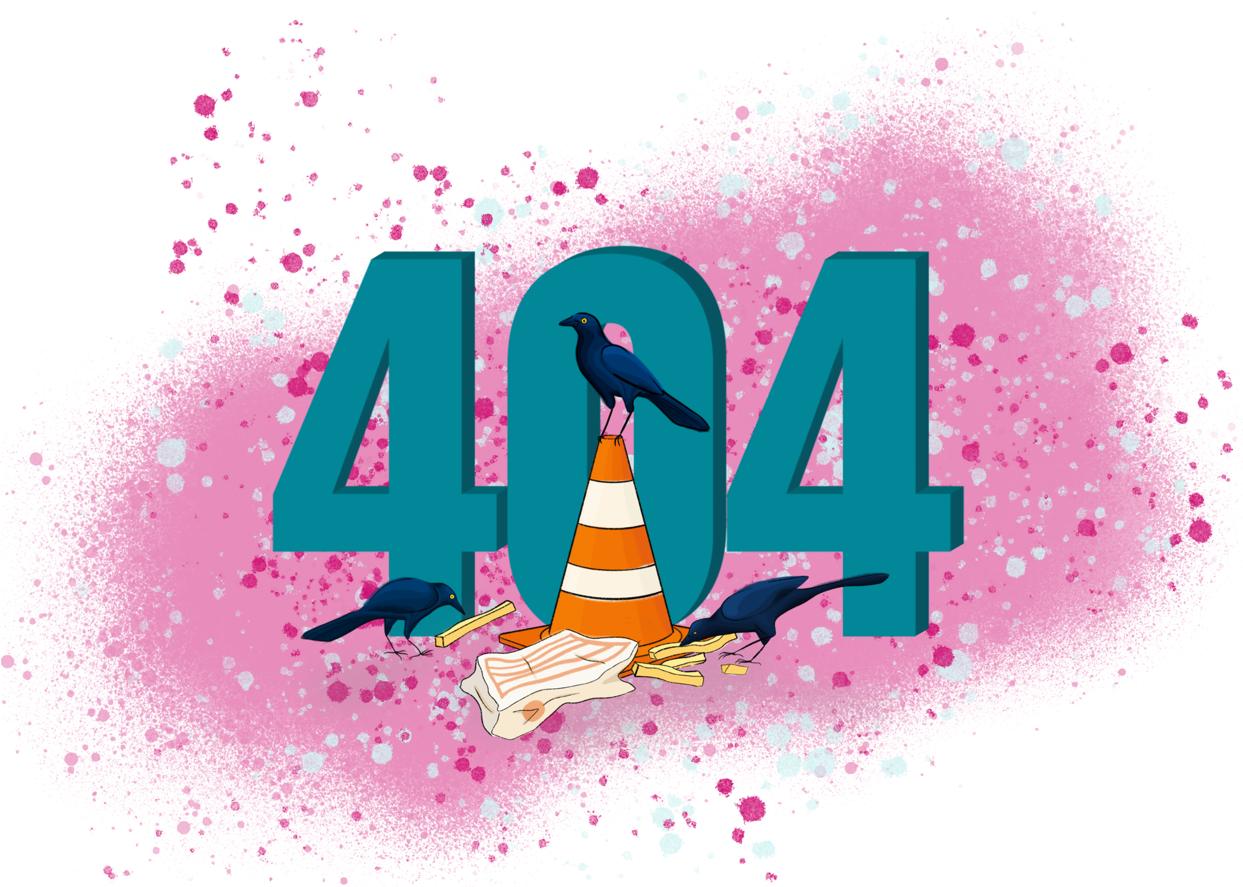
One of the designers had the idea that the 404 error page should include a server tower somehow, so I took that, ran with it, and then added a little spice because why not? So I animated it. Look at those little sparks! Awesome! While observing some grackles (in the parking lot of a Walmart of course), I spotted a few birds hanging out on a traffic cone. I had an idea and decided to pitch it as well.
The designers wanted a simple splash image of Austin that incorporated The Grackles without it being too obvious and in your face. I went a slightly different direction for this last illustration and decided on a simple line drawing of Austin’s skyline (albeit slightly augmented, I had to include all the icons!).
In Fall of 2020 the website went live. It can be viewed here (www.UXinATX.com).
