TRAVEL APP PROCESS
This project began with a strong desire to improve the existing travel booking apps. I despised using them - kayak in particular made me angry just looking at it - and in my own hubris, I decided I could do better. I was bored, the pandemic was in full swing, and I was freshly unemployed, so I had already been looking for something, anything, to spend my time on. I was collecting prompts from the design prompt generator sharpen.design and was bestowed “design a Mobile App for a Space Tourism Agency”. I took it and ran.
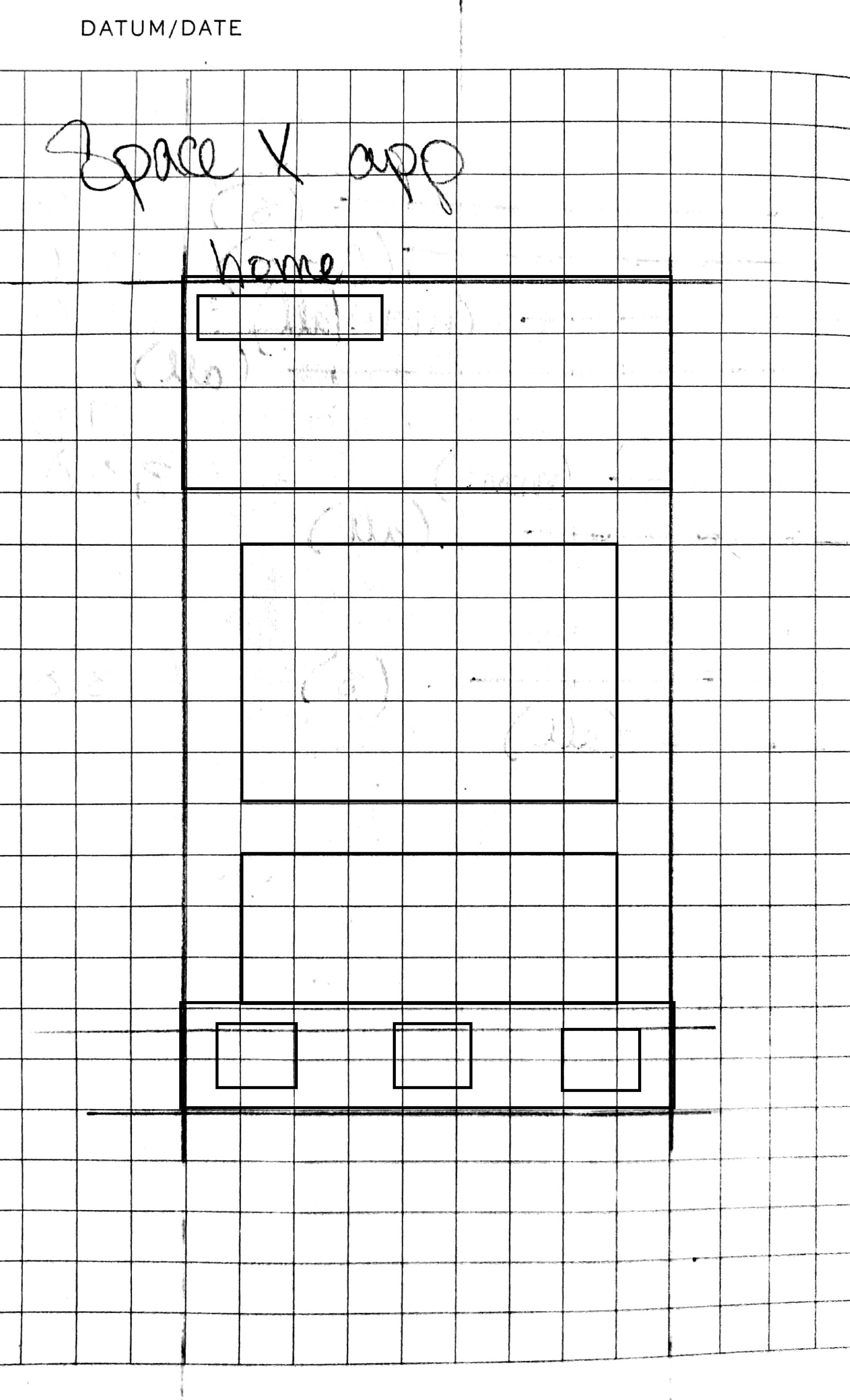
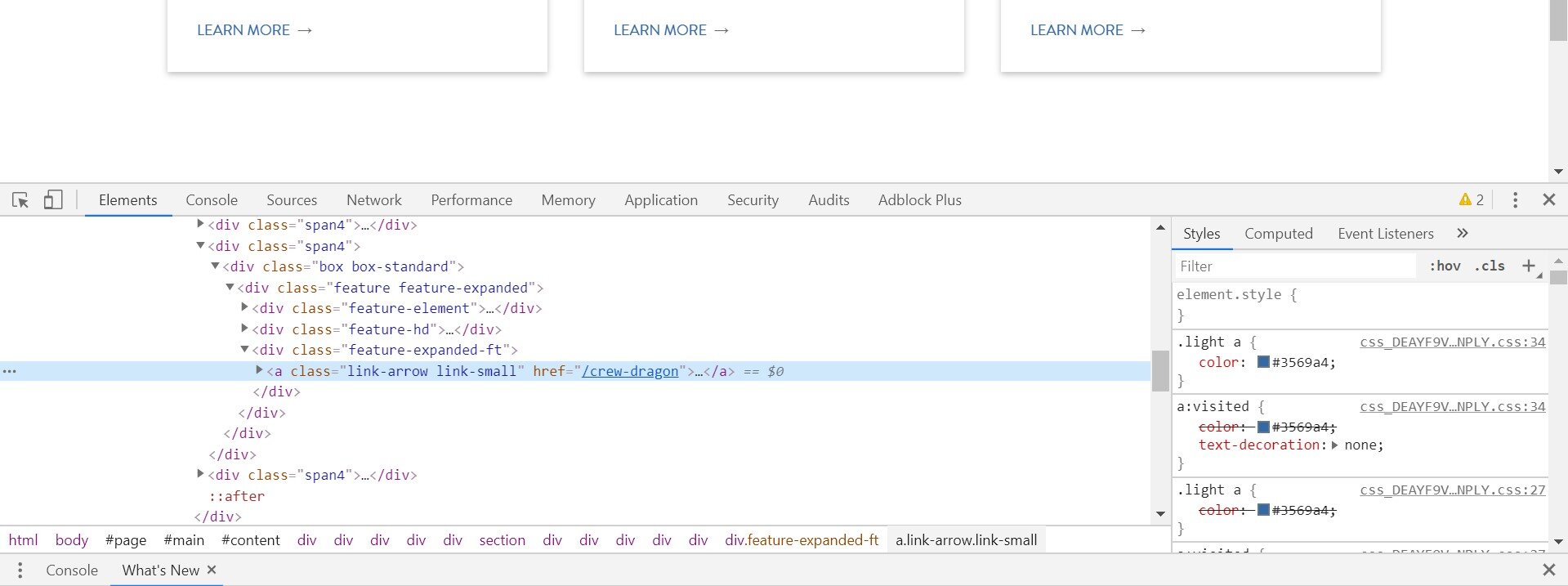
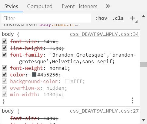
I started in my notebook - I collected information from SpaceX’s website, using the HTML code in their website to find colors, fonts, and the PNG of their logo. I sifted through pages and pages figuring out their design language, downloaded 7 different travel booking apps to find what I did and didn’t like, and then went to work. I started with a very (very) rough outline of the information architecture and a few wireframes of pages I believed I would need.
With the app outline made, quick wireframes were drafted and presented to potential app users to gain their input in the design process. All wireframing was done in low fidelity by hand. Because prototyping was rather rapid, sketches were rough, and not all were filled out before work moved to the computer to be mocked up and tested.
Before digital work could begin it was key to pull as much information about the design language of SpaceX as I could. While I did use this information, in the end I decided to take a different path from SpaceX, while still using their assets to inform my own design choices. SpaceX’s entire site is very sleek and contains large amounts of information that is well displayed. I found that there were some articles or details that were a bit tricky to find. Since SpaceX Travel is a consumer concept, everything needed to be easy to find and easy to read. Light color schemes seem to be easier to read and follow and I found that the sharp difference between the black and white portions of the original website didn’t give me or my potential users the feeling that I was looking for. The accent blue used throughout the site became my main color with white, grey, and the occasional black supporting. I did find myself experimenting with the high contrast feeling that SpaceX currently uses and found that I enjoyed using it on the Home page of the app as a call back to SpaceX’s website.
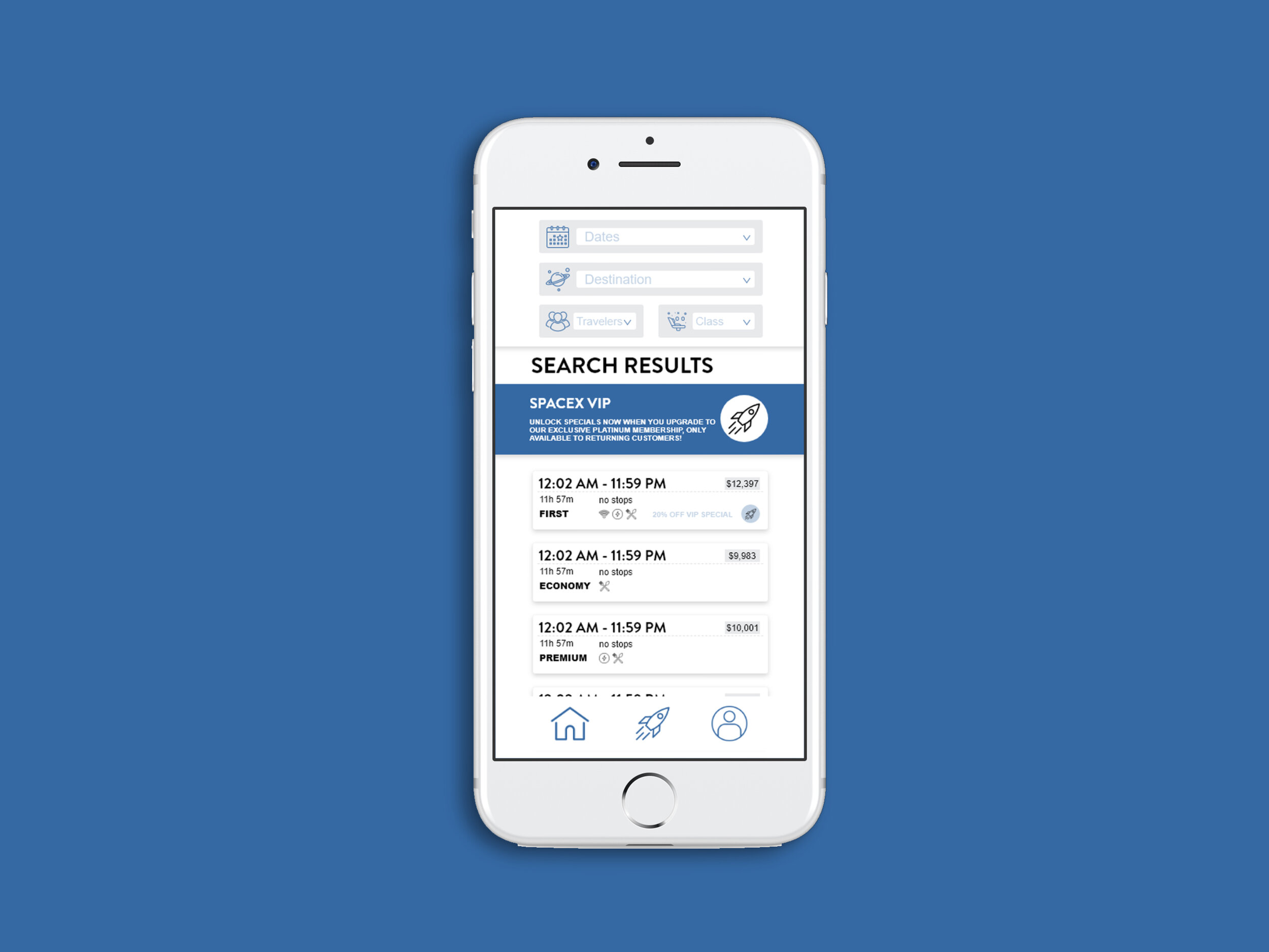
With the outline and wireframes already made, creating the app in XD was a snap. I began by making an artboard for each planned page, and started from the home page and worked in a hierarchical order, from the pages accessible by the universal navigation to the supporting pages.
High fidelity mockups were next. It was during this phase that I received the most input from others which made it a tad difficult, as I had to go back several times and restart my mockups. While I found it frustrating, the input was very valuable and led to some major changes in the content organization, and helped me consolidate several pages and make the whole experience more streamlined for consumers.


